

The bread and butter
Making their debut on the Financial News Network as far back as 1983, the Bollinger Bands are a technical analysis tool that harness the simplicity of basic statistics to provide valuable information on financial securities, most commonly stocks and options.
The technical indicator is composed of three horizontally stacked trendlines. These are known as the upper, middle, and lower bands, and they’re representations of two statistical concepts that many are already familiar with: averages and standard deviations.
The middle band represents an average, usually the 20-day simple moving average (20-day SMA), which, as its name implies, denotes the average priceof a stock within a 20-day period. Each data point on the 20-day SMA is calculated by averaging the closing prices of a stock in the last twenty days. What results is a squiggly line that commonly dissects candle sticks and slithers in accordance to overall trends.
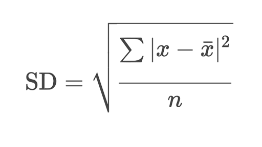
The upper and lower bands represent standard deviations. In a nutshell, a standard deviation is a number that describes how close the data points you are observing are to one another. A high standard deviation means there’s increased variance in your data, while a low standard deviation denotes the opposite. For all practical purposes, knowing the formula for standard deviation is redundant given today’s technology, but I’ve included it for those curious minds and those who enjoy scary-looking things.
The upper and lower bands are, in fact, reflections of one another. Both represent (typically, 2) standard deviations from the middle band, but one represents the positive deviation (the upper band, added to the moving average value) while the other represents the negative one (the lower band, subtracted from the moving average value).
After every new “close” is formed, the standard deviation changes, as the set of data its describing is also changed. What results are two bands that constrict and expand depending on the variance in the data, and because the data we are observing is the stock price, this variance is in fact the volatility of the stock.
So what?
You might be wondering how some statistical concepts that bored you to death in high school have any impact on how you trade or how you view the financial markets.
If you would excuse one more return to the statistical world, you will find that a powerful concept called Normal Distribution allows us to utilize Bollinger Bands to figure out when a stock is overbought or oversold.
More specifically, the Empirical Rule, which tells us that, in a normal distribution, around 68% of data falls within one standard deviation from the mean, around 95% within two standard deviation of the mean, and around 99.7% within three standard deviations of the mean is what helps traders identify support and resistance and determine overbought or oversold commodities.
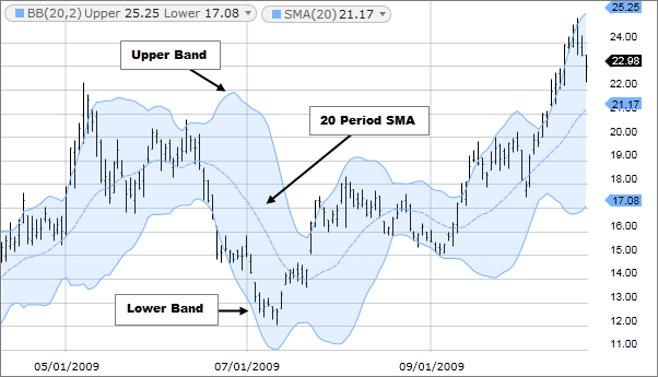
The figure below is the stock chart of Blackberry (ticker “BB”) with Bollinger Bands set at a standard deviation of 2. This chart provides ample opportunities to see how a trader would use Bollinger Bands to identify and execute trades.
Notice, for example, how the candles at 05/01/2009 break over the upper band.
Statistically, this means that the price action at that level is a very strong outlier (< 5% of other price points reach this area), and traders use this information to bet that the stock will undergo mean reversion or, in other words, a “correction” back to normal price levels. They short the stock and take profit either at the 20-day SMA or, for the more daring, the lower band.
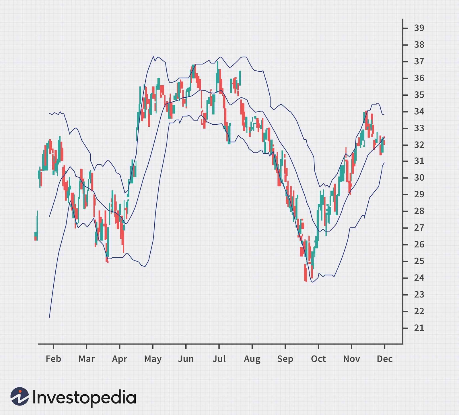
A break of the Bollinger Bands is not the typical buy or sell signal, however, and many traders focus on bands as support and resistance levels, especially during long consolidation periods or “squeezes.” The Microsoft Corporation (ticker “MSFT”) chart above shows how during the months of May, June, and July, the Bollinger Bands squeezed as the stock price consolidated, solidifying the upper and lower bands as significant support and resistance levels. In this case, traders may utilize the mean reversion strategy to short stocks when they’re at the upper band and buy stocks when they’re at a lower band, taking profit as the price returns to the mean.
Another way to utilize Bollinger Bands is through trend following. Using the same chart, one notices how following this May-to-July squeeze, there was a huge breakout to the downside, which resulted in a three-month downwards trend. Breakouts after Bollinger Band squeezes are almost a guaranteed sight. Low-risk traders capitalize on this breakout by looking for pullbacks to the 20-day SMA to either short or buy the stock, depending on which way the stock is trending. In this case, an ideal short position is presented in early September, as MSFT crawls back to the middle band only to plummet around 6-7 points by late September.
There are countless ways a trader or investor may utilize Bollinger Bands, but all strategies are ultimately subsets of mean reversion and trend following.
Beware of the bands
While Bollinger Bands can provide actionable information for a trader or investor, they must always be interpreted within context. A touch of the upper band in an upward trend, for example, is far from an invitation to short a stock, much like the tap of the lower band is in a downward trend. Novice traders would do well to makes sure they fully understand how to identify trends before they attempt to trade using this technical tool. Overall market conditions may also override a potentially “safe” buy or a “safe” short and must also always be kept in consideration.
Tips from the pros
Many professional traders use other technical indicators in conjunction with Bollinger Bands, including volume bars, the BandWith indicator, %b indicator, and BBTrend indicator. The idea is simple: two or more closely related indicators may provide a more accurate representation of the market than one alone. Beware, however, of convoluting your charts; there’s such a thing as too much information.
Remember also that John Bollinger was a huge advocate of Rational Analysis, a term he himself coined and one that represents the overlap between technical and fundamental analysis. His Bollinger Bands provide, I think, the perfect opportunity to utilize this approach. Note how, for example, extremely poor earnings (a fundamental catalyst) can be used in conjunction with a breakout after a Bollinger Band squeeze (technical catalyst) to create a perfect short setup, or how good earnings can be used to justify the buying a stock trading at the lower band during a consolidation period.
A cautionary reminder
Perfecting Bollinger Band strategies requires mastering several skills, including execution timing, pattern identification, and context-analysis to name a few. These required skills make consistent success a difficult feat for traders and investors alike. They blur the lines of what can be achieved. What is certain, however, is that used in the correct way, simple moving averages and standard deviations can mean the difference between a profitable trader/investor and a non-profitable one.
Disclaimer
DO NOT BASE ANY INVESTMENT DECISION UPON ANY MATERIALS FOUND ON THIS WEBSITE. We are not registered as a securities broker-dealer or an investment adviser either with the U.S. Securities and Exchange Commission (the “SEC”) or with any state securities regulatory authority. We are neither licensed nor qualified to provide investment advice. We are just a group of students who diligently follow industry trends and current events, then share our own advice, which reflects our personal position in the market.